Fact Check: Old map resurfaces on internet, people go gaga
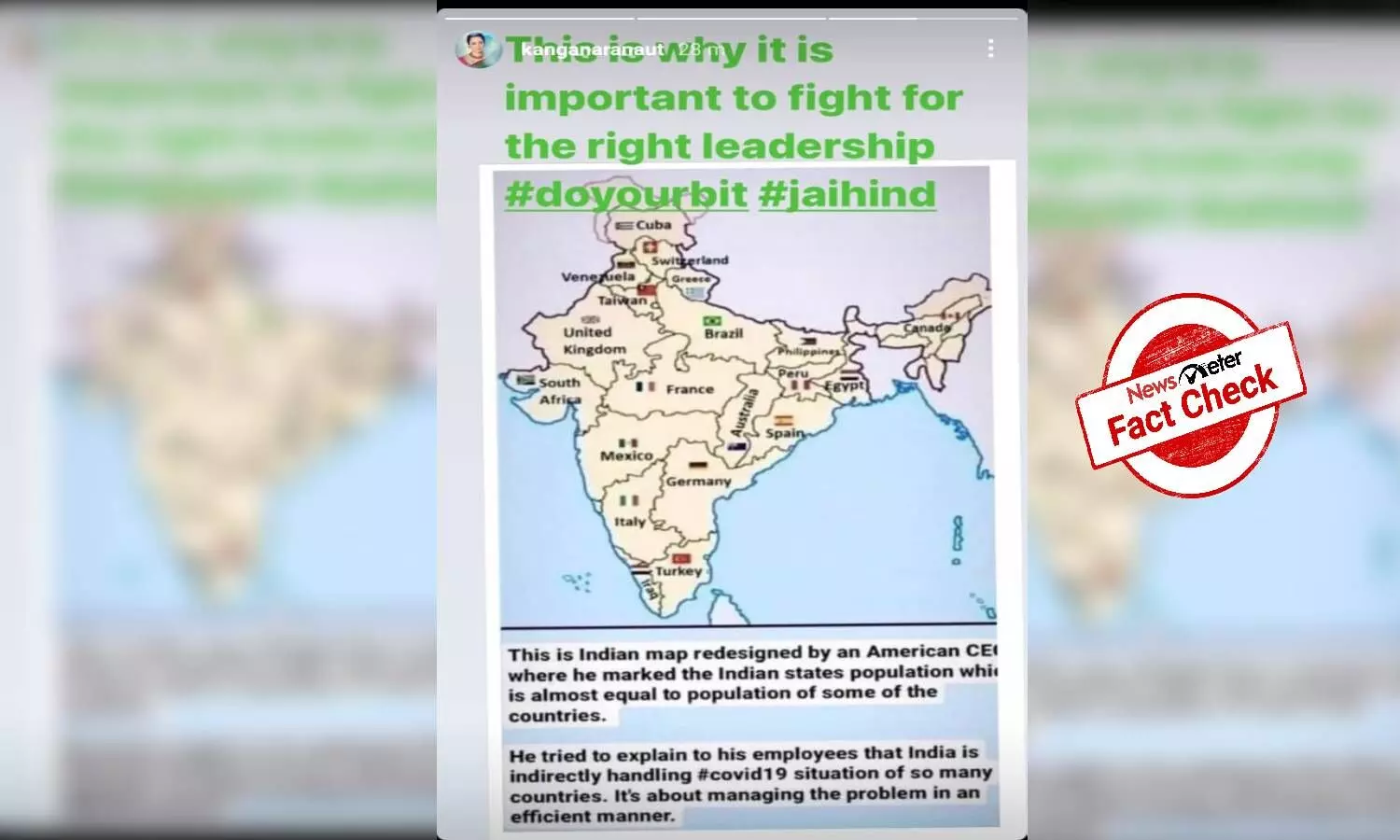
On June 11, 2021, the map was shared by Bollywood actress Kangana Ranaut on her Instagram handle. She shared the post with a caption, “This is why it is important to fight for the right leadership #doyourbit #jaihind”
By - Tejal Sinha |
Hyderabad: A post claiming that the Indian map was redesigned by an American CEO is viral on social media.
On June 11, 2021, the post was shared by Bollywood actress Kangana Ranaut on her Instagram handle. She shared the post with a caption, "This is why it is important to fight for the right leadership #doyourbit #jaihind"
Fact Check
The post that is being shared is Misleading.
NewsMeter firstly did a Google Reverse Image Search and found a possible related search titled 'Indian Population compared to world'.
Click here for the image link
We found a couple of similar images which directed us to a tweet by Ram Madhav, an Indian politician who served as the National General Secretary of the Bharatiya Janata Party.
He had shared a screenshot of a similar image on his Twitter account with the caption 'Interesting map' on April 15, 2020.
Interesting map pic.twitter.com/l7BdZ8BW9g
— Ram Madhav (@rammadhav_rss) April 15, 2020
Another Twitter user had shared the image of the map on April 15, 2020, with a caption, "This Indian map redesigned by an American CEO (?), by marking Indian states population which is almost equal to some countries in the world. He tried to explain to his employees that India is handling #Covid19 situations equal to 23 countries altogether. I bow to Modiji"
This indian map redesigned by an American CEO (?), by marking Indian states population which is almost equal to some countries in the world.
— NRC & UCC Next 🇮🇳 Jai Shri Ram🚩 (@pardhu_leo) April 15, 2020
He tried to explain to his employees that India is handling #Covid19 situation equal to 23 countries altogether.
I bow to Modiji 🙏
WA pic.twitter.com/fvCRaDd5If
We found a video by TV9 Bharatvarsh on YouTube. The channel aired a bulletin on April 14, 2020, that had shown identical data from the viral map. TV9 Bharatvarsh only concentrated on the population of Indian states which is equal to countries across the globe. The channel praised PM Modi for the same.
(The news can be seen from 29:07)
We then found a report by Latestly on April 17, 2020. The report had stated that the map in the viral post is from 2012 and was posted by an Indian Quora user. The map had nothing to do with the COVID-9 situation. The picture was first shared by Arpan Srivastava on Quora in 2012
While doing the research, we found a reply tweet by Arpan Srivastava to a tweet about the viral post. He tweeted, "Thanks @SMHoaxSlayer. Actually, this image was created by me using MS paint, for a Quora answer 8 years ago: http://shorturl.at/dgCMW. Back when I used to have too much time on my hand. I am flattered that ppl think that American CEOs spend their time doing this kind of shit."
Thanks @SMHoaxSlayer. Actually, this image was created by me using MS paint, for a Quora answer 8 years ago : https://t.co/P0hOICcdZD. Back when I used to have too much time on my hand.
— Arpan (@appysrivastava) April 15, 2020
I am flattered that ppl think that American CEOs spend their time doing this kind of shit. 😂
Meanwhile, the viral post had also claimed that the US CEO redesigned India map to laud the Prime Minister on Covid-19. As the map was created in 2012, Modi was serving as the chief minister of Gujarat at that time.
Evidently, the map was created in 2012. It was neither created nor had anything to do with the pandemic. It was not created by an American CEO. It was also not created to laud the prime minister.