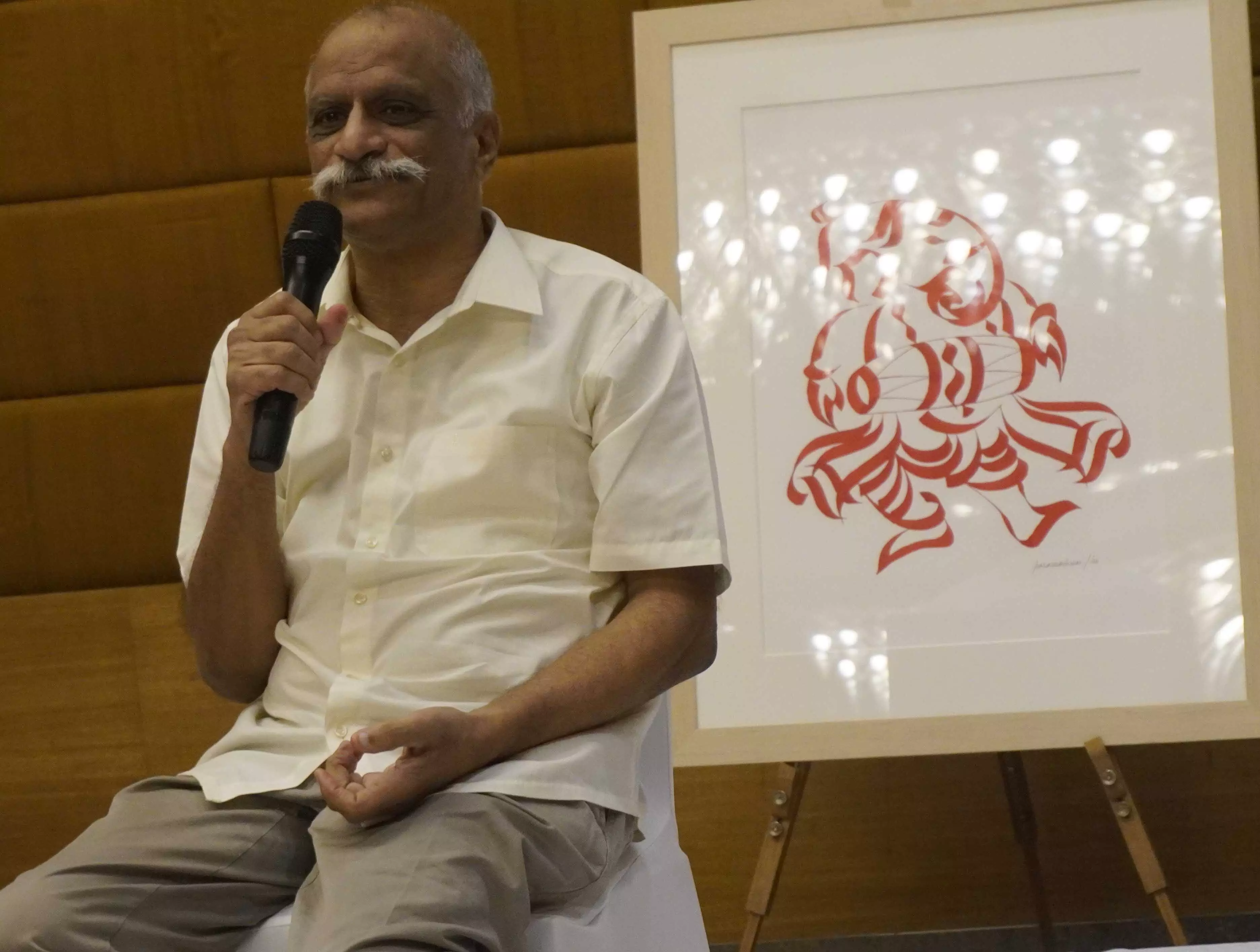
Wonderful Calligraphy: Telangana's Poosapati Parameshwar Raju blends Indian iconography with modern design
457 works out of thousands were selected by Telangana's Poosapati Parameshwar Raju for Wonderful Calligraphy
By - Anoushka Caroline Williams |
Poosapati Parameshwar Raju
Hyderabad: Poosapati Parameshwar Raju, renowned for creating a unique genre of calligraphy that blends Indian iconography with modern design, has unveiled a book encapsulating his four decades of work.
Wonderful Calligraphy is written by Koeli Mukherjee Ghose, an artist, historian, and curator. In the book, he showcases 457 of Raju’s most significant pieces. The launch, held at Hotel Marigold, marks a moment in the Indian art world, offering insight into a practice that has transformed calligraphy into a visual narrative.
In an interview with Newsmeter, Raju discusses the key moments that shaped his artistic path, his innovative techniques, and his reflections on the future of Indian calligraphy.
NM: You've had a remarkable 40-year journey in the world of calligraphy. Can you tell us about the key moments or milestones that shaped your artistic path?
Raju: Over the years, my artistic journey has been marked by several significant moments. The initial discovery of how the Devanagari script could be manipulated and transformed into visual forms was the first spark. The opportunity to showcase my works on national and international platforms also propelled me forward, making me realize that calligraphy could transcend beautiful text and become a pictorial language. Every new series I developed has been a step forward, but the creation of "Pictorial Calligraphy" stands as a monumental achievement.
NM: What inspired you to venture into this new genre of 'iconic calligraphy'? How did you develop this unique style?
Raju: My inspiration came from a deep engagement with traditional iconography and Indian scripts. I wanted to breathe life into the script and see how it could represent something more than just written language. Over time, I began to explore how calligraphy could integrate with visual art, and that’s how 'Pictorial Calligraphy' was born. It was a gradual evolution that happened as I experimented with shapes, forms, and symbols, blending them with my spiritual and cultural leanings.
NM: How has Indian ceremonial culture influenced your work, particularly in terms of iconography, signs, and symbols?
Raju: Indian ceremonial culture has deeply influenced my work. The rituals, customs, and sacred symbols are embedded in the way I understand art. Each symbol—whether it's Aum, a yantra, or a divine figure—holds immense significance, and my calligraphy seeks to capture this. My use of the color red to represent Shakti is just one example of how I integrate these cultural elements into my work.
NM: You adhere to the 'thin-thick-thin' principle in your calligraphy. How do you balance maintaining this strict structure while exploring creative expression?
Raju: The 'thin-thick-thin' principle creates a rhythm in my work that acts as both a limitation and a freedom. It requires precision and control, but within those bounds, I find endless opportunities to explore shapes, forms, and ideas. It’s about mastering the discipline and then allowing creativity to flourish within it.
NM: Your exclusive use of the color red to symbolize Shakti is unique. Could you explain how this choice of color reflects your spiritual and artistic philosophy?
Raju: Red is not just a color for me; it embodies the energy of Shakti—dynamic, creative, and transformative. In design, red is used cautiously because it highlights imbalances in composition. In my art, it signifies the feminine force, and by exclusively using this color, I challenge myself to achieve balance and channel life force into my forms. This choice aligns with my belief in the power of symbolism in art.
NM: Minimalism is a strong aspect of your work. What role does this aesthetic play in conveying the deeper meanings of your art?
Raju: Minimalism allows the viewer to focus on the essence of each symbol, form, or stroke. By removing unnecessary elements, the viewer is drawn to the purity of the message, which is often layered with cultural and spiritual significance. This simplicity can often evoke a more profound connection with the work.
NM: 'Wonderful Calligraphy' is the first volume in a three-part series. How did you approach curating the 457 works showcased in this book from your extensive collection?
Raju: Selecting 457 works out of thousands was an intense process. I wanted this volume to reflect the diversity and evolution of my journey in calligraphy, so Koeli carefully curated pieces that highlighted key stages in my artistic development. Each work was chosen for its cultural, symbolic, or artistic significance, and the aim was to present a narrative that is both personal and universal.
NM: How has working with Koeli Mukherjee Ghose enhanced the storytelling behind your works, and what do you hope readers take away from this book?
Raju: Koeli has been instrumental in translating the depth of my work. Her understanding of art history, particularly Indian art, has allowed her to articulate the layers of meaning embedded in each piece. I hope readers come away with an understanding of how calligraphy can serve as a bridge between traditional contexts and modern imagery, and how it has been empowered to depict stories rooted in our culture.
NM: Looking back on your career, how do you feel about the impact your work has had on the art world? What do you consider your most significant contribution?
Raju: I feel deeply encouraged by the impact my work has had, particularly in blending traditional Indian calligraphy with contemporary art. My most significant contribution has been the creation of a new genre—Pictorial Calligraphy—which has pioneered the elevation of calligraphy into a distinct visual art form.